Looking back at my photos of Toulouse 2-Le Mirail, I’m struck by a common visual trait: the sheer repetition of cartesian grids in academic space.
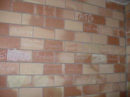
The very tiles on the walls are gridded.
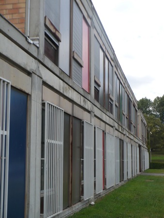
The bars and grills of the windows recede along their grid towards an unreached vanishing point.
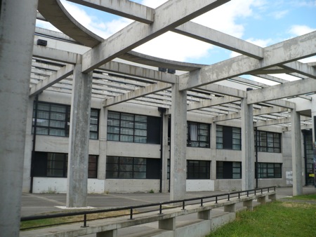
In a courtyard at Toulouse, the pillars run in rows. The cement beams run in columns. The bench has a predictable railing. The windows are little boxes of crosses. The grass is boxed in. The one curved cement beam in the open ceiling only serves to set off the space’s overall linearity.
The chairs and desks are in alternating rows, their regularity still evident even if we look at them from an angle.
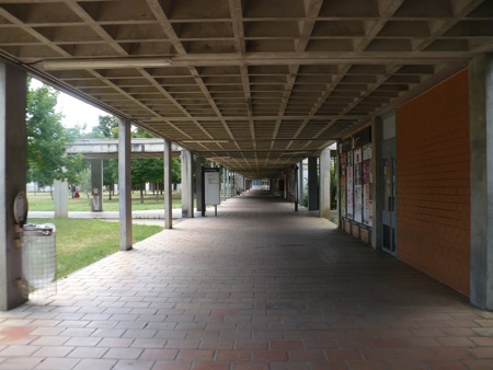
One starts to wonder if the campus was designed to make the individual feel a sense of vertigo in the face of the endlessness of this rectangular tunnel. The plane of the ceiling, broken up into a vast set of cement indentations, mirrors that of the tiled walkway. The sides, admittedly, are less regular, but even there we see regular columns, symmetrical pathways leading off on both sides.
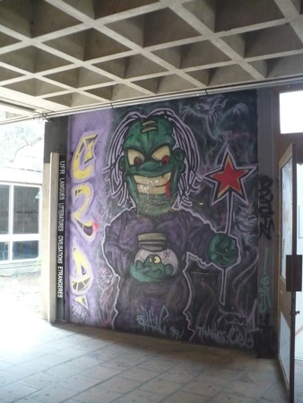
The deeply gridded forms of this campus space make for an even more unexpected contrast with this mural, with all its organic and chaotic lines, with its clashing colors and sense of incongruous corporeality, its bulging green face and stark hair, the folds of its purple robes.
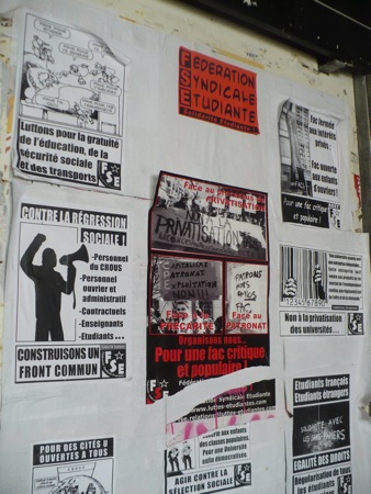
At the same time, not all student decoration breaks with the grid form. Here we can see that even the activists sometimes decide that their posters look better laid out in a neat 3 x 3 square.
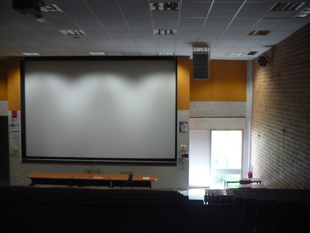
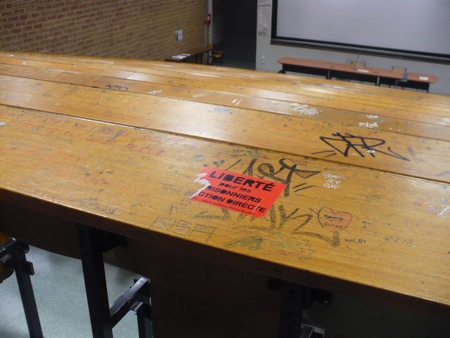
If we look inside a lecture hall, we can see down to the vast square of the projection screen, the grid of the ceiling, the grid of the brick walls, the rectangle of the table, the rectangle of the doors, the smaller rectangles of the papers taped up on the walls.
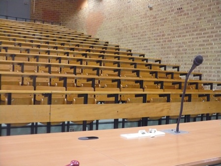
Looking up from the point of view of the professor, we can see the crease where the pattern of the bricks meets the pattern of the desks.
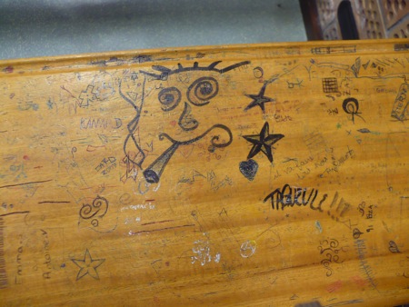
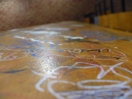
Though if we look closer, we can see that graffiti takes over on a smaller scale, rupturing the longer rectangular patterns of the bolted-down furniture, taking us away from the regimented view towards the professor’s dais that a lecture hall is designed to create.
One has to remind oneself that even if we look close up at the graffiti, even if we try to lose ourselves in its colored snakes and curls, we still see the blurry edges of the long wooden tabletop stretching off again into the distance along parallel lines that appear to meet.
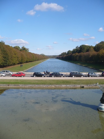
There is long precedent for this kind of Cartesian architecture in French official spaces. This here, for instance, is a gigantic canal built as an ornament to Napoleon’s former palace at Fontainebleau. It too stretches out almost to the apparent horizon, flanked by rows of identically pruned trees.
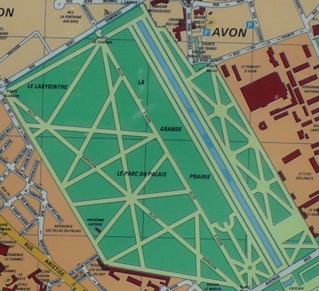
Even seen from above on maps, the griddy similarities are evident. Here’s Napoleon’s park at Fontainebleau:
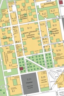
And here’s the grid of the Toulouse campus:
Obviously this second map is much denser and more convoluted than the park, but the similar pattern of long avenues remains apparent.
I’m still not really sure what to make of this apparent cultural-architectural pattern. And of course grids are hardly the sole invention of the French. But there’s something to be said for trying to notice patterns and preferences, like this Cartesian pattern, that usually pass without notice, being entirely taken for granted in the course of everyday life.

You should read james c scott’s “Seeing like a state”