I’ve been looking at a lot of operational dashboards lately.
The question presents itself: How do you read anything meaningful from a graph?
Training the eye
The human eye has exquisite pattern recognition capabilities.
And yet by default they are not always enough. They might have to be trained.
When I was 17 years old, still in high school, I got interested in astronomy. I lived in a college town where you could take some classes at the local university, so first I took the undergraduate astronomy survey course, and then enrolled in an independent study with a physics professor. She was probably 65 years old and she was happy, I think, that some kid was so interested in her field.
So we worked through some chapters of an undergraduate textbook, R.C. Bless’ Discovering the Cosmos (1996), and covered various topics in stellar evolution. I remember looking at a photo of some stellar phenomenon in the textbook and being asked: “What do you see here?”
“I don’t see anything,” I said.
And my professor pointed out some little dots on the image and explained what they meant.
She could see something I just… couldn’t.
Even though it was a simple diagram that we were both looking at.
You have to train the eye to see diagrams in a given domain.
Diagrams tell stories
Enough about astronomy; let’s talk about web services.
Suppose you have a graph over time of 5xx (internal error) responses from a set of web services in different environments.
Someone is asking you, “Do we currently have an ongoing incidnt? Or is the incident over?”
You find some data. Let’s say it looks like this:
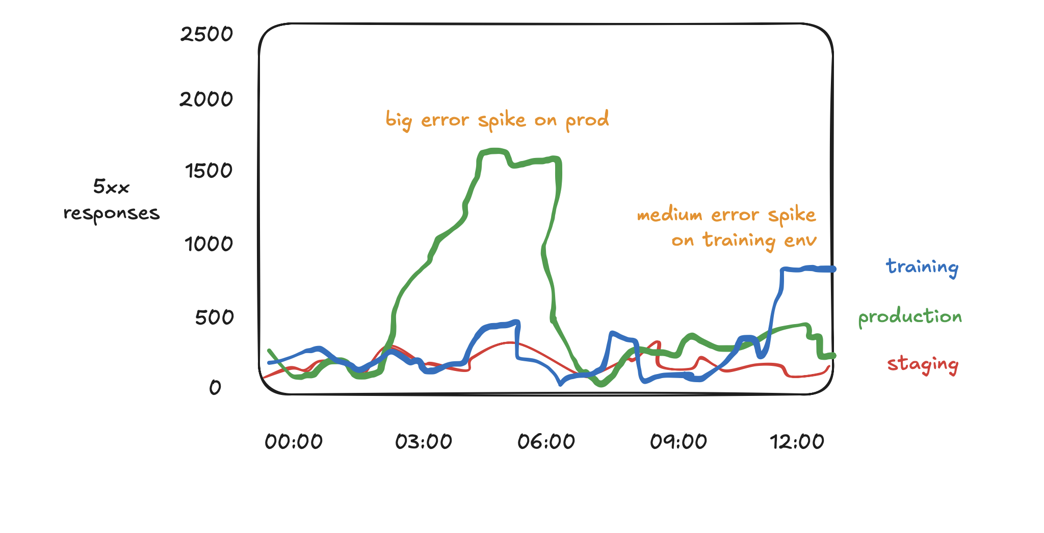
You can tell a story about this image that’s something like:
“There was a period of heightened errors on our production system earlier, lasting for a few hours. It is now done. There is also a more recent error spike in the training environment, but it is very low priority because the training environment is not a critical system.”
But if you had a different context, another story you could tell from this would be:
“There is always a non zero error rate for this system, which is normal. There are a few relative blips in the error rate, but they are all very tiny compared to the 10 million successful requests per hour that this service handles.”
You have to know what counts as “baseline” to tell a story from a diagram.
Yet another story you could tell about this diagram would be like:
“This is a graph based on application server data, with telemetry emitted after each request is complete. However, upstream of this system is a load balancer, which has recently started showing much bigger error spikes up to 15,000 errors per hour. These bursts don’t appear at all on the current graph, because these requests are overloading the application server and breaking the instrumentation system.”
This brings us to a second important point.
All diagrams lie
You can’t trust diagrams. You can learn from them, but you have to understand they are, by design, partial and limited.
Here are a few ways that diagrams can lie. (There are many others.)
- Diagrams are probably missing data. For instance, maybe there are cases that are invisible to the telemetry system you use. As we just suggested, if your telemetry comes from back-end application servers, it might miss errors that are only apparent upstream at the load balancer. Or if your application process crashes or gets halted by Kubernetes, it probably can’t report its last state before halting.
- Visualization requires aggregation functions. Aggregation functions are inevitably going to mislead you. Do you want to see the median, the mean, the 95th percentile, the 99th percentile? There is a particular limit case in my Prometheus dashboards where the aggregation query fails to count the first value in a new series. I think it’s because they are based on
increaseandincreasedoesn’t handle this nicely - my guess is that it tries to compute a difference between time A and time B, but the difference between “undefined” and “1” is represented as 0, not 1. - Timeslices matter hugely. For instance, if you are counting events over time, you might have to count them over a given timeslice. And the graph is almost always going to look bumpier, noisier, when the timeslice is smaller. However, for performance reasons, you can’t use small timeslices over large intervals.
- Metrics may have a collection interval below which you can’t disambiguate. If you scrape Prometheus metrics data every 60 seconds, for instance, then you simply cannot see sub-minute spikes in the data series, no matter what you try. As with music, the sampling frequency matters.
Nonlinear behavior is common
Diagrams can lend themselves to the illusion of linearity. You can often identify linear-looking traffic growth over time, or even determine visually that traffic appears steady state.
At some point, the illusion (or assumption) of mostly linear behavior is going to break down. Databases will run out of resource limits and performance will plummet. Small fluctuations in a noisy baseline graph will suddenly resolve into huge spikes in an outage.
You have to train yourself not to expect linear behavior in complex systems, because they are fundamentally nonlinear, and will hit limits suddenly.
You have to learn, gradually, how to include adequate “safety factors” in your assessment. “My system has used 80% of its available resources, does this mean we can keep waiting until we use 95% of resources? Or should we increase resources now?” It depends on your forecast of possible linear or nonlinear growth in the future.
This implies one last point.
Your understanding of diagrams reflects your understanding of the system
If you are a visually inclined person, then graphs and diagrams can be powerful tools for building understanding of a system.
However, at the same time, your baseline understanding of a system feeds into what you can read out of a diagram based on that system.
Ideally, these two constraints are mutually reinforcing instead of being mutually disabling.
For example, if you always deploy new code every Tuesday morning, then you might know intuitively that a latency spike on Tuesday mornings is related to the deployment event, and not otherwise concerning.
However, if you just see a latency spike on the most recent Tuesday, and you don’t have any other context, then you might spend some time chasing down various nonsense theories and speculations before you eventually figure out that the same spike happens every Tuesday.
(Here is a version of this that I’ve lived through: Q: “Why is there a huge latency spike towards the end of the month? What’s broken?” A: “Oh wait… it’s the end of the fiscal quarter and usage is always heightened at this time.”)
You have to let yourself learn from graphs and diagrams (we should never throw away any source of useful knowledge), while also recalling that graphs and diagrams often lie, and almost always omit important context.
As with so many other things, experience isn’t everything, but it counts for a lot.